trvl.
Role: Lead Designer - Feature Scoping, Interaction Design, Visual Design, Prototyping
Team: Kaelyn White, Sophie Kim, Jessica Kitamura, Arshdeep Shienh
Timeline: 3 Months, '23
Overview
Trvl aims to revolutionize travel planning with our all-in-one app tailored to the needs of the modern traveler offering a feed of best-rated travel destinations, an intuitive map and feed, and an in-app rating system.
With a comprehensive suite of features, Trvl’s focus on the up-and-coming generation of travelers sets it apart from other platforms. Trvl is designed to seamlessly guide you through every step of the traveling journey, making travel planning exciting and easy.
Problem
Through our interviews, we found that travelers aged 19-24 found it hard to find the right places to go for attractions, and there is no definitive app that does it all. Participants stated they used multiple apps during their travels, whether it be for trendy recommendations or reputable reviews.
Young travelers are unable to find the right places to go, on one platform, the information is not centralized.
PROBLEM STATEMENT
Empathizing with our audience
Based on our findings of our user interviews we compiled a list of requirements for our product, followed by some user personas to better understand our audience.
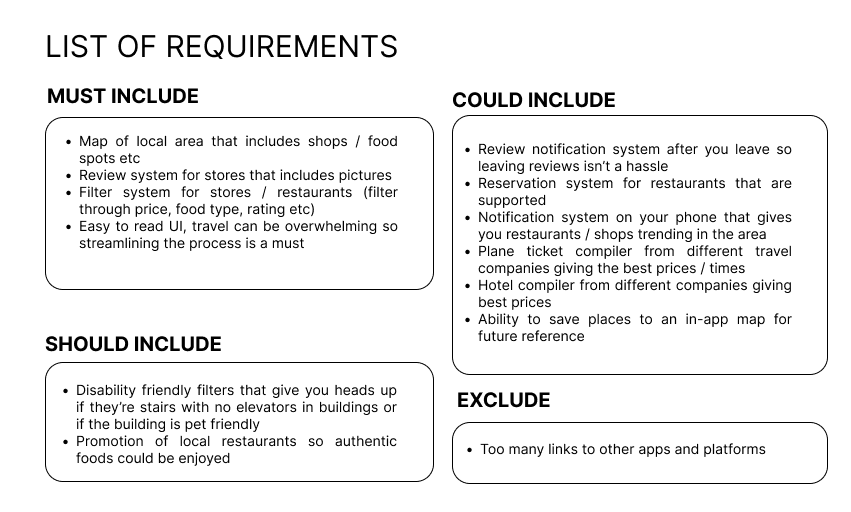
FIGURE 1 - LIST OF REQUIREMENTS
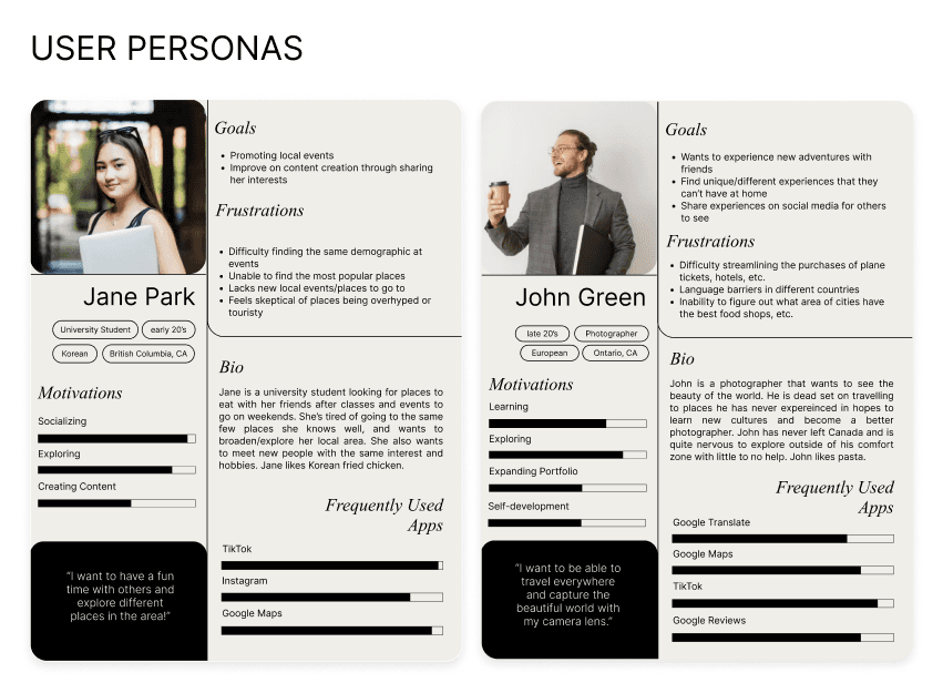
FIGURE 2 - USER PERSONAS
Ideating our initial thoughts
Going through multiple brainstorming sessions and various, we explored different ways to implement our features.
We narrowed down our iterations on our feed since it was going to be our primary feature. We explored various feed layouts like the infinite scroll, masonry layout, and in our case a map view through our sketches.
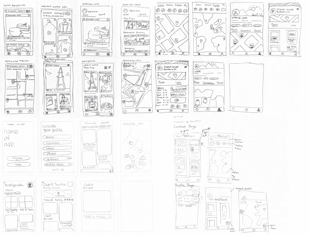
FIGURE 3 - LOFI SKETCHES
Through our sketches, we found that the masonry layout, accompanied for a map view would best fit our needs in terms of our list of requirements. It allows flexibility for the user to choose what best fits their immediate needs.
This was a crucial step in the design process since we were in the first steps of the process, and changes to our design could be done easily. This allowed us to be more critical with our sketches and designs.
Prototypes!
Developing our idea from our initial sketches, we made paper prototypes of the primary features Trvl offers, to get a better grasp of the user journey.
FIGURE 4 - MOBILE PAPER PROTOTYPE VIDEO
Heuristic Evaluations
After finalizing the screens, it was time to start bringing our sketches to life! We had a basic mid-fi prototype which served as a working ground to start user testing to get more data on our app. We conducted user interviews and heuristic evaluations to put our work to the test.
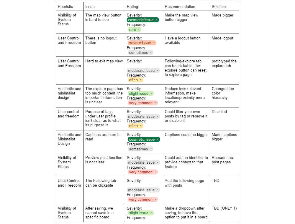
FIGURE 5 - HEURISTIC EVALUATION SUMMARY
Considerations
Our heuristic evaluations pointed out some flawed design choices we made throughout the process, pointing out issues and bugs in the 10 heuristic categories. Mainly changing the visibility of the system status as it seemed unclear during the user interview.
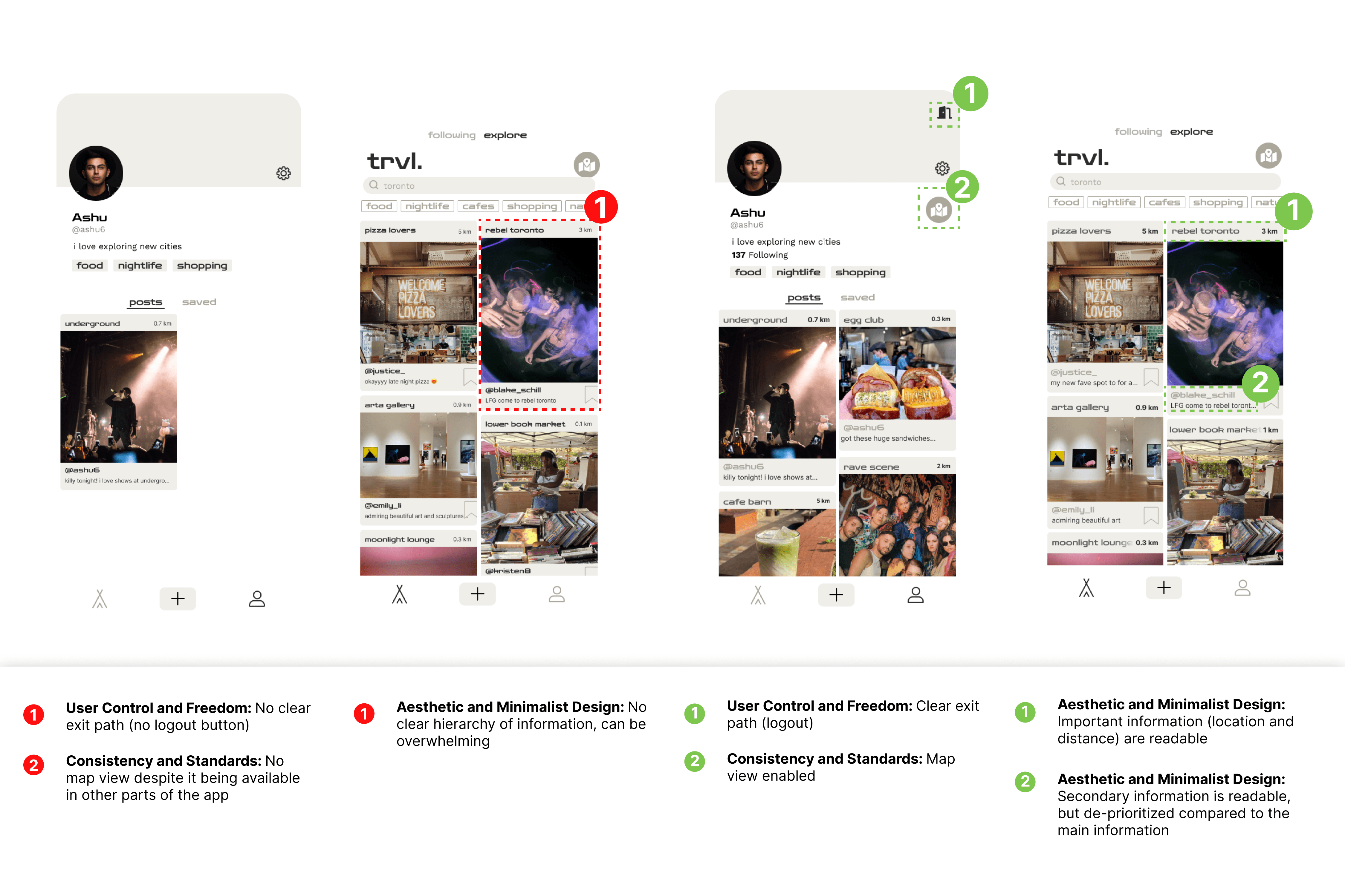
FIGURE 6 - SCREEN ITERATIONS
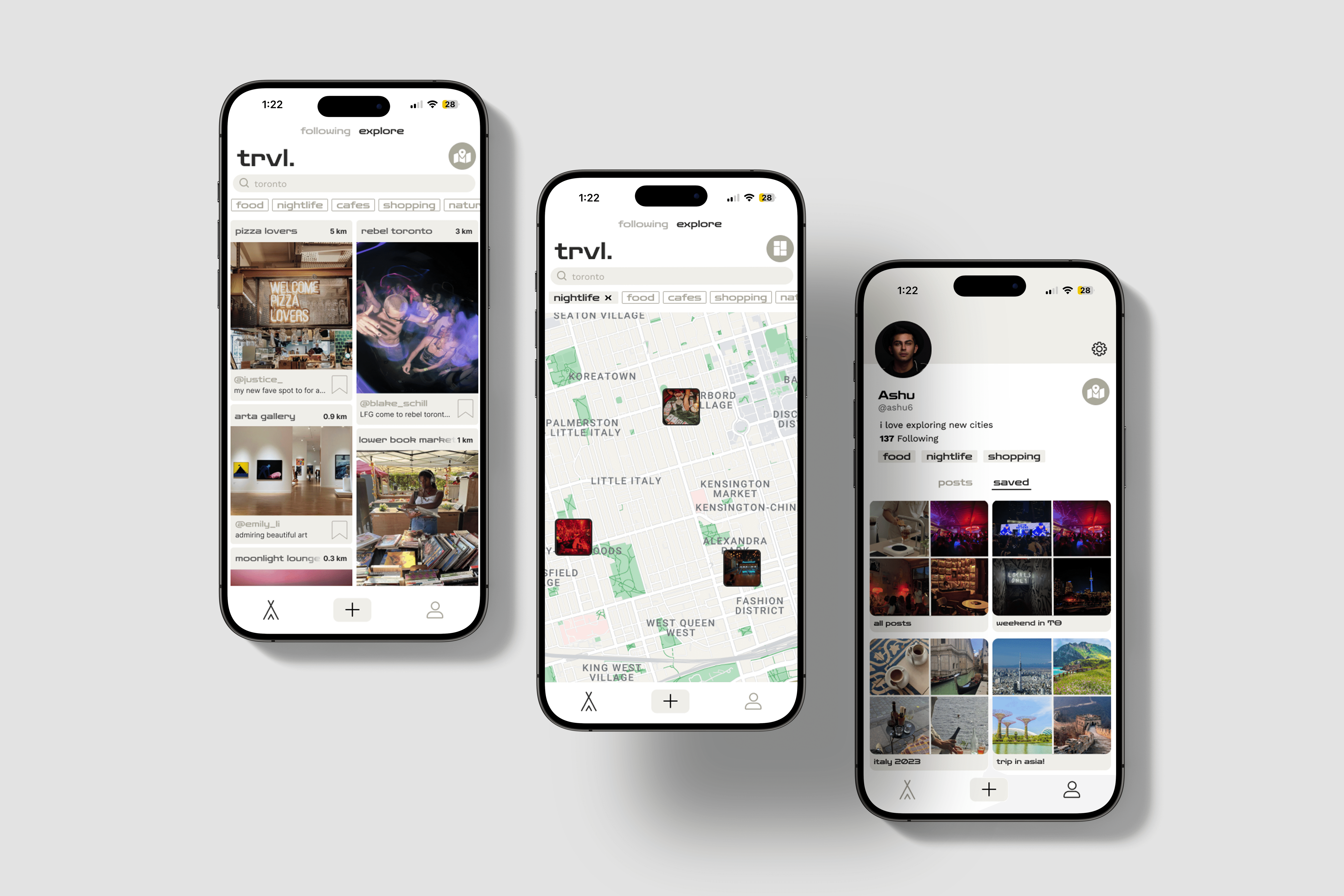
Final Solution
Feed
Main user task is on the feed, featuring both masonry layout and map view showing the local attractions. Feed allows for filtering based on what you’re searching for which makes finding places to go enjoyable.
Post and Review
A review system for users to post, rate, and write about businesses and events.
Profiles
A personal profile of places you’ve visited, and any saved posts in a collection to ease the travel planning process. Businesses can take this feature to their advantage by advertising their business to others, in which everyone’s review will be collected into the business profile.
Design considerations
Our objective when creating our design was to make it appealing to a younger demographic. Keeping a minimal design system that conveys a modern touch to our app.
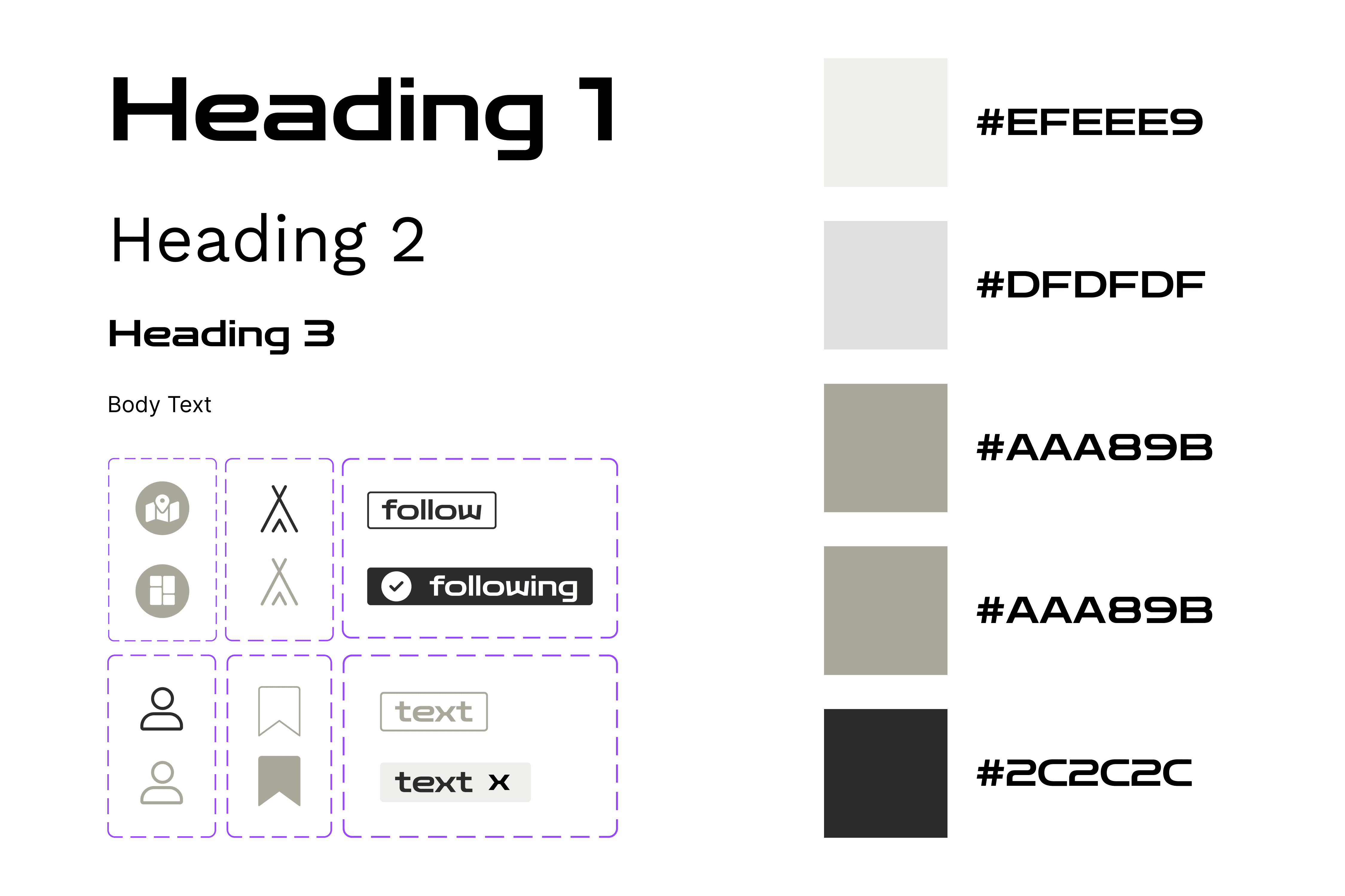
FIGURE 7 - DESIGN SYSTEM
Key Takeaways
As my first UX design project, I had a lot of fun developing my idea while working with a team. A lot of time was spent on the design process and a lot of changes (undocumented!) were made before this final product.
I took away a lot of lessons from this project…
Visual Design
Although a lot of time was spent designing, there is always room for improvement! I tried to replicate a lot of industry standard apps, but next time I would look for more successful examples of popular apps and learn from already successful apps and integrate them into my work.
Accessibility
Looking back at the project, a question I would ask is "Can everyone use this app?" or "Are all the design elements readable?". Coming with a graphic design lens, there was not as much consideration toward high-contrast elements or overall accessibility compliance. Creating an inclusive app means that everyone can use it.